
Hello everyone,
Some of my latest posts have been dedicated to cover reveals and I’ve mentioned in all of them how much I love covers, so I believe the subject of this post will not surprise you.
I admit it, I do buy books because of the cover! I know that the cover per se does not tell us if we are buying a quality product or not, but the truth is, we do buy things that are appealing to the sigh, and that happens to me with books. I am always captivated towards books with beautiful, enticing covers and when the cover is everything but appealing, I tend to walk away. Of course I pay a lot of attention to the author, the plot, etc, but the cover is one more detail that could make me buy a book or not. It shows a certain taste that I often see reflected in the writing. Sometimes I stop to read the blurb of a book just because of it’s cover, and if the cover was not attractive I probably would never have read the blurb or bought the book, hence the importance of covers for readers such as me.
I love everything about covers, all the small details in it; the colours, the background, the font, the balance between the front cover and the back cover, etc. And I find that sometimes back covers are disregarded as inferior parts of the book, but I love them as much as front covers, I love to find a book whose back cover reveals me something about the story! And the good covers often do, have you noticed that?
This passion I have for book covers made me cross paths with Janet Taylor’s designs and fall in love with her work. In fact, I first learned about Janet because I could not resist the cover of The Secret Betrothal by Jan Hahn and had to buy the book because of it. The cover was amazing and because I loved the book so much I decided to look for other things from the same designer. I soon found several covers designed by Janet and became a fan of her work ever since! I don’t know if it is a coincidence or not, but several books with covers designed by her were actually some of my favourites in the year they were published 🙂
Today I’m honoured to say she is my guest as she agreed to answer a few questions about her work 🙂
I also invited the authors with whom she worked with to share a little of their experience with her, and I could not be more delighted to read all these wonderful stories surrounding their covers and the process of their creation (have I mentioned how much I love to read about covers?)
I hope you enjoy reading this interview and the author testimonials as much as I did 🙂

Janet you are quite active in the JAFF community with your blog More Agreeably Engaged, your blog tour coordination and the wonderful JAFF designs, but when did this love for Jane Austen and fan fiction began?
Rita, I am a late bloomer to the JAFF community. It was the last of 2010 or early 2011 when I started reading JAFF. I was going through a bit of a rough time and my friend, Jan Hahn, sent her copy of the 1995 miniseries of Pride & Prejudice home with me to watch. She thought it would be good for me! Ha! I guess you could say it was! I have since immersed myself in anything I could get my hands on, Jan’s books included. This was before An Arranged Marriage had been published but it was already in the editing process. I fell in love with it as soon as I read it and it is still one of my favorites. Believe or not, until that time, I had no clue that Jan wrote JAFF and her stories had been on forums since 2001 or shortly thereafter. Anyway, I had read Pride & Prejudice as a young girl but hadn’t picked it up again until after watching the miniseries.
.
And when did it go from reading to drawing?
In 2012, Jan Hahn was getting The Journey read for publication. She asked me to draw Darcy and Lizzy and a highwayman. I did it but on regular typing paper and with regular colored pencils. It was not used for her cover but that was the beginnings of my drawings. I then decided to attempt the two drawings that I call ‘The Look, Darcy’ and ‘The Look, Lizzy’ from one of my favorite scenes in the miniseries. I’ve been drawing ever since.
.
I always wonder if you took an arts degree of if you are self-taught, can you tell us a little of your progress in drawing?
I always loved to draw as a child. The summer after my fourth-grade year, there was a traveling artist that came at the invitation of our school. My mother and father allowed me to attend his two-week class where I learned about shading and a few other things. I loved the class but it is my only training.
Since I generally do not have a model, I use a photo for my model. I study it before I draw, while I’m drawing and after I complete a drawing. I look for places where my drawing is vastly different from the photo and what I could do to make mine look more like the photo. Many times it can be a shaded area as small as a couple of millimeters or 1/8 inch that alters how my drawing looks. It wouldn’t seem like something that small could make so much difference but it can. Too much shading, too little shading, not enough curve to a nostril or too much – these can make or break a drawing.
.
I think it’s impressive what you can create without an arts degree, it takes true talent! Which type of drawings captivate you the most? And which are the most challenging?
I think I like close-up facial drawings the best of all. They allow me to go for the details and details are ‘my thing’ so to speak. It is all in the details. I love to do the eyes and usually do them first. Since the eyes are the windows to the soul, they are the most important feature. I love to try and capture the expression in the eyes. Sometimes I get it and sometimes I don’t.
As for the most challenging, I will have to say the nose on the facial drawings. It is what always gives me the most trouble. I know you asked which types of drawings and this is not a type but a part of the one I love most. My most challenging drawings would probably have to be buildings. I’m a math person, (I used to teach college preparatory mathematics to high school students) and the lines in the buildings need to be parallel. If they are not, it drives me crazy. It also makes me crazy trying to get them that way! lol
.
I know what you mean about the eyes! That’s what captivates me the most in your drawings! You’ve used some of your drawings to do covers. Could you tell us a little bit more about your cover art design?
Designing covers is one of my favorite things to do. I love trying to bring a good story to life through the front and back covers. I am a cover junkie, too, Rita! 😊 Meryton Press gave me my first opportunity to design a cover. It was for Linda Beutler’s The Red Chrysanthemum and I was a nervous wreck in the beginning. I did drawings for the first three covers at Meryton Press, Linda Beutler, Suzan Lauder and Jan Hahn. I did some drawings for J. Dawn King that she used as part of her covers in The Men of Derbyshire Series. I now mostly do graphic design since drawings cannot be ‘fixed’ as easily as graphic designs. It would be great if I could hit a delete button and fix something but that is not the case. If I have used darker colors, they can be almost impossible to remove without ruining my paper. Sometimes, I must start over and that takes much time.
.
I know you have lots of merchandising in your website. Do you use all your designs to create merchandising at JT originals? What kind of products can we find there?
I use most of my drawings to create merchandise at JT Originals. I have not had the new ones from 2017 made up yet as I am trying to get a new vendor to do them for me. I do have note cards and note pads from the new drawings. I do those myself so they are easily available.
I have mugs, mouse pads, tiles, compacts, Christmas ornaments, two sizes of note cards and two of note pads. I can do address labels and bookmarks if they are requested. I am hoping to soon have prints on canvas for any drawing available for purchase.
.
One of the merchandise you have on your website is an anual calendar with original drawings. How did that idea come up? Any idea’s for this years calendar? I know we’re still in the beggining of the year, but I’m already looking forward to your next calendar 🙂
I have been doing a calendar since 2013. I had gone to England in August of 2012 for a tour of the 1995 PnP film locations. It was fabulous, by the way! 🙂 One of the tour guides is a Jane Austen scholar and is also a writer. She knows the man that has his art at the Jane Austen Centre in Bath. I had told her of my drawings when viewing some of his in the village that was Meryton in the miniseries. Without my knowledge she contacted him and later told me that I would be able to sell my work. If you notice, I always have ‘my artistic interpretations of the scenes’ either on the back of the calendar or somewhere inside. That was what he told Hazel Jones to tell me. Since 2013 was the 200th anniversary of the publication of Pride & Prejudice, Hazel said that could be a good year for me. I’m not sure how it went from there, but the calendar was born. When I got home, I got busy drawing. The rest is history, so the saying goes.
I do have some ideas for the 2018 calendar. It will be drawings too. I’m thinking of possibly using the same men/films as last year but in a different way. That’s all I’ll say for now. Suffice it to say, I think the changes will be ones that you will approve! I’m looking forward to the next calendar too. I will begin working on it in a few weeks. I need to get started on the drawings.
~~~
Thank you so much for allowing me to interview you Janet! I feel I could continue discussing every single detail of your drawings with you for hours. I am also a known geek who absolutely looooves merchandising, so I can not resist sharing with my readers some of the products you have on your website JT Originals 🙂
The 2017 Calendar has to be the first to be displayed 🙂 I remember eagerly waiting for Janet to share the next drawing that would be included in this years calendar, I knew Colin Firth would have to be in it, but I was thrilled to see that Richard Armitage and Ciaran Hinds as Mr. Thornton and Captain Wentworth respectively, were also included. I would just ask you to take a closer look at Ciaran Hinds card, isn’t it just perfect with the letter drawn in the back??
Oh…and you should look at all the faces here because Janet is offering one set of 12 cards with each one of these gentleman in one of the cards 🙂
But I could not finish my part on this post without showing a little more of what you can find at JT Originals. I confess to own a few of these items and to look forward to the new merchandising Janet will create with the new drawings, particularly the one of John Thornton 🙂
.
I’m sure you’ve noticed by now how much I like and admire Janet’s work, but I’m not the only one loving her work! I’ve asked some of the authors who worked with her to write a few words about that experience, and was touched by how special they herJanet to be 🙂

Nicole Clarkston
When Janet first wrote to me about No Such Thing As Luck, she graciously offered to host me on her blog. I had never explored the JAFF community at all, so I thoroughly enjoyed clicking through all the sights at More Agreeably Engaged. When I discovered her artwork, I was astonished. This lady has a true gift for capturing characters real or imagined, and her eye catches the balance, the light, and each nuance of expression. As a writer, my desire is to push the pause button on special moments, translate them into print, and breathe life into them. Janet does that very same thing with her images.
Though I barely knew her and was not quite certain what I was letting myself in for, I had to ask Janet to work on my next cover! As it happened, that was for Northern Rain, a book which was less than half completed at the time. Since we had months (at the speed I write), we spent that time becoming friends as we talked over cover ideas. Janet is what we Americans colloquially describe as a “Good People.” May I brag on her as a person a little more before returning to her work?
Janet was, very appropriately, my first taste of the wonderful enigma that is the JAFF community. She uses her speech and her actions to bless others, and you never hear a word of her which is not spoken in admiration. She encourages authors, bloggers, and readers alike, and she employs her precious time helping others find a good read to wind down after a hard day. When she is not blogging about new books or painting her breathtaking Richard Armitage portrait, she is a proud grandmother, a supportive mother, and a loving sister. In addition to these things, she spends her spare time caring for rescued dogs. Her heart truly aches for these canine orphans, and she invests more time and love into them than many people do into their own children.
Janet’s son Jeff happens to be a talented designer in his own right, and the two of them have continued to grow their artistic talents together. I have been the happy beneficiary of their combined efforts! I will allow Janet to fill you in on those details, but I would like to draw your attention to some of her trademarks. Firstly, each book cover she creates ties into the story. As far as I know, she has read every book before creating the cover, and she creates a visual catch for a reader to pause and take in. If you capture every detail she lovingly drops into that cover, you may as well not read the book, for you have already divined its essence.
Another talent of hers is for the eyes. They spark, snap, draw you in, or set you at ease. A talented actor is able to convey with a simple look an entire novel’s worth of feelings, and Janet can trap that look forever on canvas. Unlike with my own vocation, she cannot simply hit the “delete” button, so every flick of the brush must be precise. I will never know how she can transform an unruly glob of paint into (here I go again) Richard Armitage’s tender, impossibly eloquent expression in the legendary Kiss Scene, but she does. She even manages to create my favourite look on my period heroes- a roguish 5 o’clock shadow! How? Well, she tells me that it has something to do with admiring the real thing for hours on end, and I suppose there are less pleasant ways to develop a talent.
Perhaps it goes without saying that I have already forced Janet to promise that she will craft the covers for my next projects. I could not imagine turning my book babies over to anyone else! I am glad that this amazing woman is receiving the recognition she deserves for her work. I hope that one day soon we will all be able to sit down to a cup of coffee with Janet’s RA portrait smiling back at us. A Colin Firth coaster would match nicely, I think, and perhaps a Matthew Macfadyen mousepad would round out the collection. Good luck in the giveaway, everyone!

Jan Hahn
About ten years ago, I met Janet Taylor (in the flesh). Our personalities clicked, and we soon became friends. Four years passed, however, before I shared my love of Pride and Prejudice with her, much less the fact that I wrote Austen-inspired stories. I was a bit shy about my obsession. About the same time, I learned that she was an artist and a skilled photographer of the ‘critters’ that roam her property out in the Texas hill country. I soon discovered an abundance of information about birds, squirrels, raccoons and other wildlife. And what did Janet learn from me? She fell in love with Mr. Darcy and JAFF, a whole ‘nother type of wildlife.
My second novel, The Journey, was about to be published, and I wanted a highwayman on the cover. Janet drew a colorful picture of Darcy, Elizabeth, and a blonde highwayman dressed all in black. Unfortunately, my publisher couldn’t accept the scene because of copyright issues: Mr. Darcy happened to look exactly like Colin Firth, and Elizabeth was the spitting image of Jennifer Ehle. Well, why wouldn’t they be? Firth and Ehle were Darcy and Elizabeth in Janet’s mind.
Meryton Press, however, was impressed with Janet’s work, and they commissioned her to draw covers for two of their authors, Suzan Lauder and Linda Beutler. By the time The Secret Betrothal, was ready for publication, Janet created original versions of Darcy, Elizabeth and Wickham for my front cover. For the back of the book, she drew a beautiful beach scene, including a huge rock that played an important role in the story, as well as a pair of Elizabeth’s slippers discarded in the sand.
By that time, Janet Taylor had become well known to the JAFF world through publication of her gorgeous calendars featuring her illustrations of Austen characters. Every year, I look forward to seeing what she will come up with in her new calendar. She outdid herself this year with Austen’s Men in Film Plus Two! I love when the month changes―I get to swoon all over again.
Janet is a delight to work with. She’s interested in the story, she listens well, and she’s eager to see that the cover reflects the book. She makes my idea come to life and then suggests touches that mirror portions of the plot. For A Peculiar Connection, I found separate 19th century paintings of three young boys executed by the same artist. That was my sole contribution to the cover. Janet did the rest. She combined the boys into one framed portrait, and in the background, she added muted illustrations of a ship, a letter containing the very words I had written in the story, and an old mansion―all of which played essential parts in the book.
Janet has a fantastic eye for color and style and a more than generous supply of talent to create an attractive, eye-catching book cover that draws readers’ attention. She’s a joy to know and a great friend.


Suzan Lauder
Had you asked the author prior to publishing what the cover of Alias Thomas Bennet would look like, she would firmly state it would be composed around a ship. When I found out that Janet Taylor would be the cover artist, I sent her dozens of images: tall ships from the 1700s, men on ships’ decks, artsy ships, ships on fire, ships in a storm, ships in dry dock, you name it!
But Janet had done one special thing—she read the book and fell in love with the characters in the story. Then during one email of ships, I made an offhand comment about seeing people on shore with body language to show their stress. She somehow knew that the author wanted the “feel” of this image even though I was concentrating on the idea of a sailing ship.
The artist’s process is fascinating. Imagine a bearded young man in a ball cap, t-shirt and sports pants holding a baby doll gently in his arm as only a seasoned father can do, with the finger of his other hand being held by a toddler in diapers. The child looks off to a sound in the distance, her face slightly startled and worried, and the man looks at her with typical fatherly interest. “Is she okay? Should I comfort her or leave her be?” Does that picture in your mind seem like the front cover of a Regency novel? The cover story was already in the eyes of the models, and the magic of Janet Taylor was there to capture it, because this is her son and granddaughter!
With the use of soft core lead pencil crayons, she redrew the images, changing a ball cap to a top hat, modern casual wear to evening wear of 200 years ago, lightening hair, adding a toddler’s traveling costume, making a causeway from a backyard deck. In the background, a period sailing vessel is coming into the harbour—or is it leaving? The sky is slightly ominous, the colours telling of an unknown worry for the future, as do the lines on the face of the gentleman. We correctly assume the children are Jane and Elizabeth Bennet and the gentleman is their father, yet once we read the story we realize the additional significance of the mystery within the romance novel—so the cover becomes a bit of a teaser.
Hands are supposed to be the hardest thing to draw. Janet drew them so well that I insisted the title not cover up where little Jane held onto her father’s finger.
Little touches made this cover so special. Janet worried that little Jane would be unsafe near the water, so she added posts and ropes to keep her just a little bit safer. That’s the magic of Janet.
Meryton Press is known for back covers that are so good, they could be front covers. Longbourn was a prized theme in the story, and Janet offered up a watercolour painting of Longbourn from a photo of an English manor house taken on her own trip to England. We added some flowers to spice up the real life photo’s simplicity, but then found out that watercolours don’t look that great on covers. Janet had to re-do the back cover in the soft lead pencil crayons of the front cover.
Thank you, Janet, for making my characters come alive, putting a perfect face to my hero, and telling the story of Alias Thomas Bennet in such a succinct and clever way. I’m honoured to have had one of your unique covers!

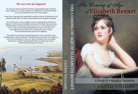
Caitlin Williams
How envious I am of those who can draw and paint. To create such beautiful images from nothing but your own imagination is a mighty skill. I have no artistic talents at all, so last year when I wanted to redesign the cover of The Coming of Age of Elizabeth Bennet, I shouted “help” in a very loud voice and in swooped Janet B Taylor ready to save the day with all her super skills.
The book previously had a very boring back cover but she found the perfect image and now it looks wonderful, and compliments the redesigned front cover beautifully.
Janet is unfailingly professional and a lovely lady to work with. She understood what I wanted, even when I wasn’t quite sure what I wanted myself. Thanks Janet and I hope we get the chance to work together soon.
.
Joy King
My meeting Janet began with two people (Jan Hahn and Jack Caldwell) and Facebook.
One of the first variations of Pride and Prejudice I read was The Journey, by Jan. I was hooked. Soon after reading her story and almost everything else available at the time, I opened a Facebook account. What was the first thing I searched? Jane Austen. I happened upon a giveaway for a book Jack Caldwell released on Janet’s stop of his blog tour. I entered, and I won.
When Janet contacted me with congratulations, I mentioned I had published my first JAFF the month prior. She invited me to be on her blog and the rest is history. I later checked out her JT Originals website and fell in love with her work. I commissioned her for three pieces of art (Darcy/Elizabeth, Bingley/Jane, and Col Fitzwilliam/Constance Wickham). The first one I put on the cover of A Father’s Sins. The others are already designed into book covers. I’m still hoping to get the stories written, because the world needs to see these gorgeous works of art.
Last summer, I saw a stunning photograph of a young woman who reminded me of Lizzy Bennet. She had the wrong hair, the wrong clothing, and the background was not correct. As soon as I mentioned it, Janet started sketching. The project is almost complete. What she has shown me is STUNNING. Will it go on one of my book covers? Oh, yes. I LOVE the work she does.
In a wonderful coincidence, Janet invited my daughter, Jennifer Joy, to do her very first blog interview after the release of Darcy’s Ultimatum. So, our family has a special place in our hearts for our dear friend.


Linda Beutler
Janet Taylor was my first cover artist for my first published JAFF story, The Red Chrysanthemum, and as it happens, I was her first cover author! The very idea of having a say in a book’s cover was a novel one at the time (so to speak), since in the design of the two books on gardening previously published, I had little input in the cover. Meryton Press gave me Janet’s contact information, and I sent along the requested list of several ideas. But Janet had her own vision, to capture the pivotal moment when Georgiana Darcy’s skirts brush the titular blossom out of sight, behind Darcy’s boots.
I’ll admit I had to be convinced. It seemed like a huge self-spoiler, but Janet forged ahead. In time I came to think it quite natural for the cover to hinge on the story’s most important plot point. My only concern shifted to the Hessians being exactly like those worn by Mr. Darcy in the 1995 Pride and Prejudice mini-series. And the legs had to be the right proportion to be attached to a certain 6’2 actor. Janet would send a version, and I would send her back to Darcy’s moments with Elizabeth at Pemberley. Did Janet really spend six hours watching that one scene, as they ascend the outdoor stairway? I shall take her at her word!
The results have been greatly praised. Janet is self-effacing, but there is no way The Red Chrysanthemum would have won a silver IPPY for romance writing in 2014 without her dynamic, manly cover. It takes a team, more than just an author’s story, and presentation is everything. What red-blooded woman wouldn’t at least pick it up to read the back cover with its glorious open red roses?
Every flower on the cover of The Red Chrysanthemum carries a message of love, and I loved working with Janet again on my latest novel, My Mr. Darcy and Your Mr. Bingley. Having worked with Janet before, I did not hesitate to suggest a crucial moment within a pivotal scene. She jumped on it! The result is beautiful and poignant and everything I wanted it to be.
.
Sally Smith O’Rourke
Like many other Jane Austen fans, I first found Janet because of her beautiful paintings of scenes from the 1995 Andrew Davies adaptation of Pride and Prejudice. I was writing a post for my blog (my idea of the Darcy’s wedding night) and wanted to use “The Kiss” to head the post, and she was gracious enough allow me to use it. It was the perfect complement to the story.
Afterwards, we stayed in touch. I advertised my JAFF books in her wonderful calendars and when I finished writing Days of Future Past, I needed a cover and Janet was where I went.
One of the great things about working with Janet on the cover was her flexibility and creativity. Originally I wanted a garden gate on the cover with a garden on the back. I owned the painting of the garden, but needed a garden gate. After reading the manuscript and seeing the ‘tea garden’ painting Janet suggested reversing the pictures, and as you can see that was a great suggestion, and was definitely the way to go.
While the painting on the cover existed, she did have to crop it and added some brightness to the images so the title would stand out. But her real talent shows in the back cover. She started with a photograph of a garden wall that she took on a trip to England. The story in Days of Future Past is about reincarnation, under hypnosis, the hero sees three garden gates, one for each life. Janet created a perfect representation of that imagery for the back cover.
They (not sure who ‘they’ are) say a picture is worth a thousand words, and in this case it is very much the fact. Picture ‘a’ is the photo Janet took, and ‘b’ is the back cover she created from it.
And right now, she’s contemplating the cover for the Christmas book, that I hope to have out this year. Keep an eye out.
For what it’s worth my blog is sallysmithorourke.com 🙂

I have to tell you that it gave me a lot of pleasure to put up this post together, and it made me particularly happy to see how kind and generous all these authors and designers were. In fact, everyone involved in this post wanted to offer something to my readers, so today we are giving away lots of goodies :))))
We are giving away the below items:
* One 2017 Austen Man in Film + 2 calendar
* One set of twelve cards and envelopes featuring one of each Austen Men in Film + 2. The cards are 4 1/4″ x 5 1/2 ” and blank inside with matching square flap envelopes. (Check the calendar pictures to see whose portraits will be on the envelopes).
*One John Thornton canvas of 8″ x 10″.
* One copy of Northern Rain (winner chooses format)
* One copy of The Courtship of Edward Gardiner (winner chooses format)
* One copy of No Such Thing as Luck (winner chooses format)
* One ebook or autographed copy of The Secret Betrothal or A Peculiar Connection (winner chooses book and format)
* One ebook copy of Alias Thomas Bennet
* One paperback copy of The Coming of Age of Elizabeth Bennet
* One ebook copy of A Father’s Sins
* One paperback copy of A Father’s Sins
* One signed paperback of The Red Chrysanthemum
*One ebook or paperback of Days of Future Past (winner chooses format)
The giveaway is international and each reader will be entitled to win one prize. To participate in this giveaway all you have to do is comment this post and let us know how you feel about book covers! Feel free to say whatever you want, I am personally very curious to know everything you will tell me 🙂
If you want to double your chances of winning, share this post on any social media and add the link to it here.
Good luck everyone!
